Here is just a fun example of graphic design today and the capabilities of the computer. It is full of eye catching colors and 3-D effects. One might almost say it it Psychedelic with all the discordant colors. I would like to see someone try to do this with out a computer.
gdHISTORY
blogs for Graphic Design History
Thursday, December 13, 2012
Derek Hess
Although Derek Hess was a part of the "Lowbrow" art movement, in contrast to that typical style, Hess did phenomenally realistic portrayals of the human figure.
Also here is a link to some of his sketches on T-shirts:
http://www.indiemerch.com/strhess/
Helvetica
After watching a film in Graphic Design History on Helvetica, I now have a new found appreciation for the simpler look of type as well as style.
It blew my mind at how passionate some of the typographers were when they were describing Helvetica. One of my favorite descriptions of it was, it is not the letters themselves that make the font, but the space around the letters that make it.
I also like how it was said that Helvetica was made not to draw attention to itself, but to serve as a channel to get a message across and nothing more.
Let's Get Physical
"Let's Get Physical"
When I saw this, I instantly knew what it was. It is the record album cover art for the Olivia Newton-John's album "Physical." It is interesting to see something made in the early 80s be digitally redesigned in the modern era.
Here's the music video if anyone wants a listen.
http://www.youtube.com/watch?v=vWz9VN40nCA
I know I will be using this for my New Years Resolution of getting into shape.
Massimo Vignelli
I though Massimo Vignelli embodied the spirit of Helvetica quite nicely.
"It just reads that way,"
is one of his quotes about helvetica, talking about how people can read helvetica just as easy as breathing.
Wednesday, December 5, 2012
A Clock Work Orange
The Kiss
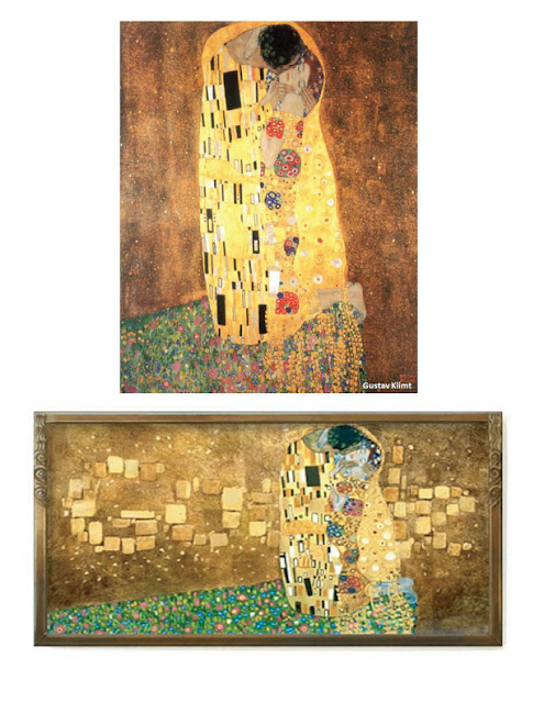
This is one of Gustav Klimt's most famous pieces, using gold leaf and his signature symbolic patterns he seems to effortlessly capture the moment of a tender kiss between two young lovers, although I am sure there is a more complex story behind this image. The top one is the original, while at the bottom is Google's rendition of Klimt's work in honor of him. I think they successfully incorporated the Google logo into the image

Subscribe to:
Posts (Atom)


